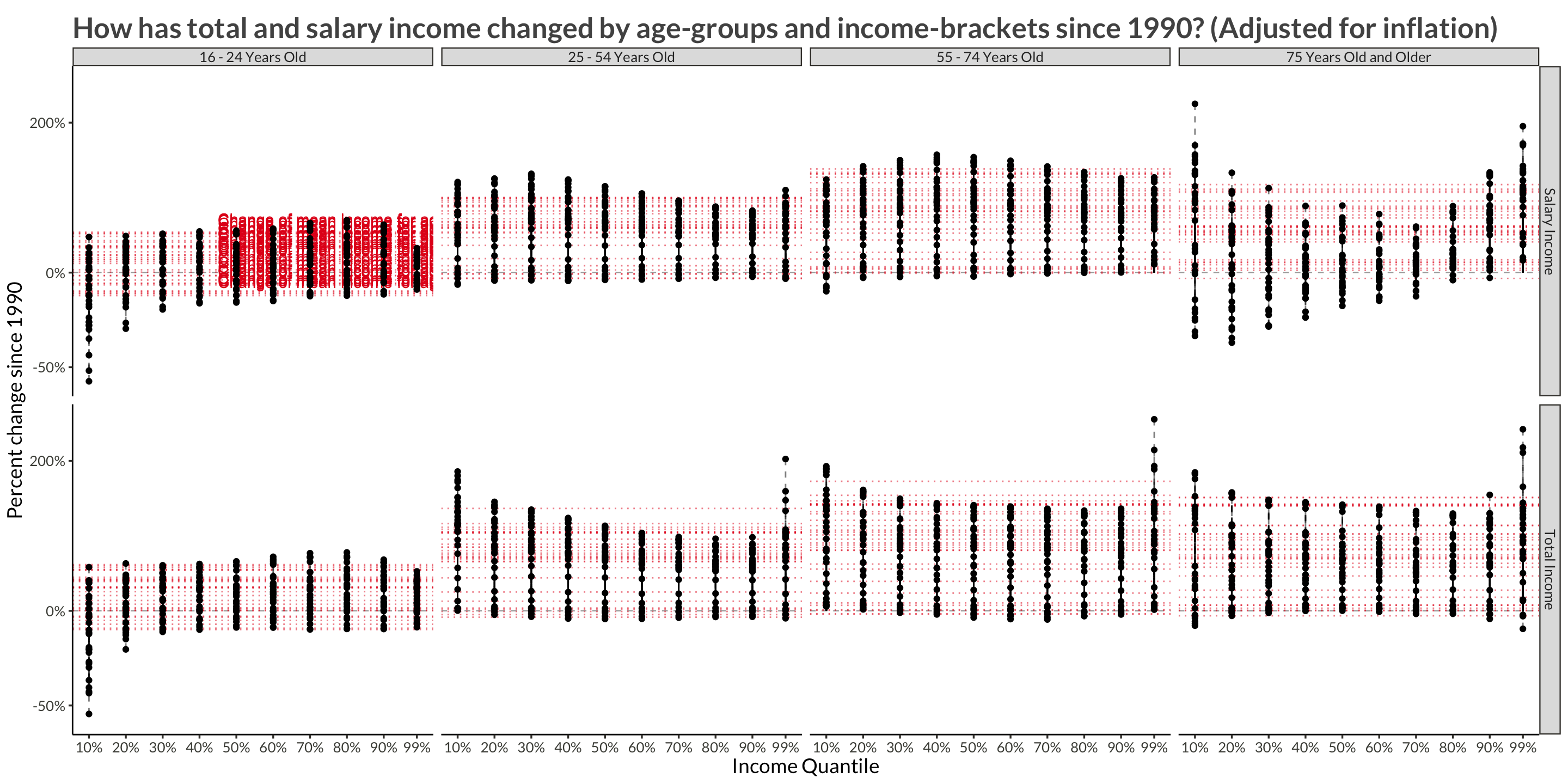
Making interactive animations with ggplotly

Simple examples of how to use the frame aesthetic in ggplotly() for easy animations

I’ve recently been making a lot of plotly graphs for my Icelandic website metill.is, where I look at official data on current topics. Since it is so simple to make animations with ggplotly I thought I might write a short tutorial on it.

english
R
ggplot
plotly
Author
Affiliation
Published

February 6, 2023

Code
library(tidyverse)
library(plotly)
library(glue)
library(mgcv)
# Some personal packages I've written with
# plot themes, functions for easily
# working with Icelandic data etc.
library(hagstofa)
library(metill)
library(visitalaneysluverds)
library(bggjphd)

theme_set(theme_bggj())

Animations with ggplotly()

Simple example

If you assign a variable to the frame aesthetic when making ggplot2 plots, ggplotly() will automatically create an animation slider and button using that variable.

Code
p <- mtcars |> 
  ggplot(aes(x = wt, y = mpg, frame = cyl)) +
  geom_point() +
  labs(
    title = "Example with mtcars"
  )

ggplotly(p)

Effect of gamma on GAMM smoothness

The gam() function from the package mgcv package has an input called gamma. The documentation has this to say:

Increase this beyond 1 to produce smoother models. gamma multiplies the effective degrees of freedom in the GCV or UBRE/AIC. coden/gamma can be viewed as an effective sample size in the GCV score, and this also enables it to be used with REML/ML. Ignored with P-RE/ML or the efs optimizer.

In the code below I fit multiple mgcv::gam() models with varying gamma parameters. I then use gamma as the frames for a ggplotly animation to see its effects on smoothness.

Code
wt_range <- range(mtcars$wt)
wt_seq <- seq(wt_range[1], wt_range[2], length.out = 70)

pred_dat <- mtcars |> 
  crossing(
    gamma = exp(seq(-4, 1, length.out = 15))
  ) |> 
  nest(data = -gamma) |> 
  mutate(
    model = map2(gamma, data, ~ gam(mpg ~ s(wt), data = .y, gamma = .x, method = "REML")),
    preds = map(model, broom::augment, newdata = tibble(wt = wt_seq))
  ) |> 
  unnest(preds) |> 
  select(gamma, wt, .fitted)

p <- ggplot(data = mtcars, aes(x = wt, y = mpg)) +
  geom_point() +
  geom_line(
    data = pred_dat,
    aes(x = wt, y = .fitted, frame = gamma)
  ) +
  labs(
    title = "Animating different parameter values"
  )

ggplotly(p) 

Icelandic Income Data

About the Data

I won’t go into detail about how I created the dataset. Let’s just imagine that we are handed data on total and salaried income for Icelanders by age-group and income bracket (quantile).

Code
d |> 
  glimpse()
Rows: 2,480
Columns: 8
$ year         <dbl> 1991, 1991, 1991, 1991, 1991, 1991, 1991, 1991, 1991, 199…
$ age          <chr> "16 - 24 Years Old", "16 - 24 Years Old", "16 - 24 Years …
$ quantile     <dbl> 10, 20, 30, 40, 50, 60, 70, 80, 90, 99, 10, 20, 30, 40, 5…
$ type         <chr> "Total Income", "Total Income", "Total Income", "Total In…
$ mean_income  <dbl> 2459.058, 2459.058, 2459.058, 2459.058, 2459.058, 2459.05…
$ group_income <dbl> 676.3329, 992.4450, 1304.8814, 1654.0750, 2043.7015, 2470…
$ group_change <dbl> 0.013355780, 0.011152832, 0.016421043, 0.012773270, 0.012…
$ mean_change  <dbl> 0.002164807, 0.002164807, 0.002164807, 0.002164807, 0.002…

Plotting

Labels and tooltips

The first step is to create fancy tooltips to pipe into plotly. These can be assigned to aesthetics (I use the aesthetic name text), and then we tell ggplotly() by writing, for example, ggplotly(tooltip = "text"). I’ve output examples of how the formatted tooltip text looks below.

Code
plot_dat <- d |> 
  mutate(
    label = ifelse((quantile == 10) & (age == "16 - 24 Years Old") & (type == "Salary Income"),
                   "Change of mean income for age group", 
                   NA_character_),
    text = glue(str_c(
      "<b>Quantile: {quantile}%</b>", "\n",
      "Year: {year}", "\n",
      "Income (yearly): {isk(group_income * 1e3, scale = 1e-6)}", "\n",
      "Income (monthly): {isk(group_income/12 * 1e3, scale = 1e-3)}"
    ))
  )

plot_dat |> 
  slice(1:2) |> 
  pull(text)
<b>Quantile: 10%</b>
Year: 1991
Income (yearly): 1 m.kr
Income (monthly): 56 þús.kr
<b>Quantile: 20%</b>
Year: 1991
Income (yearly): 1 m.kr
Income (monthly): 83 þús.kr

ggplot

Next we create the ggplot() object. It will not look very good, since all the frames are plotted together.

Things to note here:

  • The percent change variables are between 0 and 1, i.e. percentages. I want to use a log-scale such that -50% will be as far away from 0 as +100%. To do this I add 1 to the percentages and use a custom labeling function, labels = function(x) percent(x - 1), in scale_y_continuous(). This means that no change in the y-variable is represented by 1 in the data but 0 in the plot.
  • I capitalized the year variable beforehand. I could change the labeling of the animation slider after the fact, but I find this to be quicker.
  • There are some differences between ggplot and ggplotly output when it comes to text sizes and aspect ratios, so it’s good to tune the sizing after the animation is ready.
Code
p <- plot_dat |> 
  rename(Year = year) |> 
  ggplot(aes(quantile, group_change + 1, frame = Year, text = text)) + 
  geom_hline(yintercept = 1, lty = 2, alpha = 0.4, linewidth = 0.4) +
  geom_hline(
    aes(yintercept = mean_change + 1, frame = Year),
    alpha = 0.5,
    lty = 3,
    colour = "#e41a1c"
  ) +
  geom_text(
    aes(
      x = 45, 
      y = (mean_change + 1) * 1.15,
      label = label
    ),
    hjust = 0, vjust = 1,
    colour = "#e41a1c"
  ) +
  geom_point() +
  geom_segment(aes(xend = quantile, yend = 1), lty = 2, alpha = 0.5) +
  scale_x_continuous(
    breaks = c(seq(10, 90, by = 10), 99),
    labels = label_number(suffix = "%")
  ) +
  scale_y_continuous(
    labels = function(x) percent(x - 1),
    trans = "log10"
  ) +
  facet_grid(cols = vars(age), rows = vars(type)) +
  labs(
    x = "Income Quantile",
    y = "Percent change since 1990",
    title = "How has total and salary income changed by age-groups and income-brackets since 1990? (Adjusted for inflation)"
  )

p

ggplotly

Next we use this ggplot() object as an input into ggplotly(), letting it know that the tooltip can be found in the aesthetic we called text.

Code
ggplotly(p, tooltip = "text")

Further Reading

For further reading on using the plotly package, check out the free and awesome book by Carson Sievert at plotly-r.com.