Creating forest plots with coefficient tables in ggplot2 with cowplot
I’ve seen this kind of figure poking around, but I didn’t really think about them until the other day I was asked about how to make one in R. Here I will walk through making one of these plots using the ggplot2 and cowplot packages.
I’ve seen this kind of figure poking around, but I didn’t really think about them until the other day I was asked about how to make one in R. Here I will walk through making one of these plots using the ggplot2 and cowplot packages.
To start with I have some fake data, d.
Code
d |>kable(format ="html") |>kable_styling(full_width = F)
name
mean
lower
upper
Covfefe
1.1989430
1.0707825
1.358700
Coffee
1.8509518
1.5589701
2.227752
Variable
1.2181512
1.0834045
1.411683
Covariate
1.1970336
1.0699671
1.342737
Predictor
0.9085823
0.8049225
1.000000
Smoking
0.8770238
0.7447709
1.000000
Age
0.9344551
0.8305984
1.000000
Uranium
0.9177338
0.8021060
1.000000
Stuff
1.0760010
1.0000000
1.216474
Thing
0.9143605
0.7753231
1.000000
Koffing
1.0686924
1.0000000
1.178642
Coughing
1.0648236
1.0000000
1.194998
Polvo
0.9227277
0.8097846
1.000000
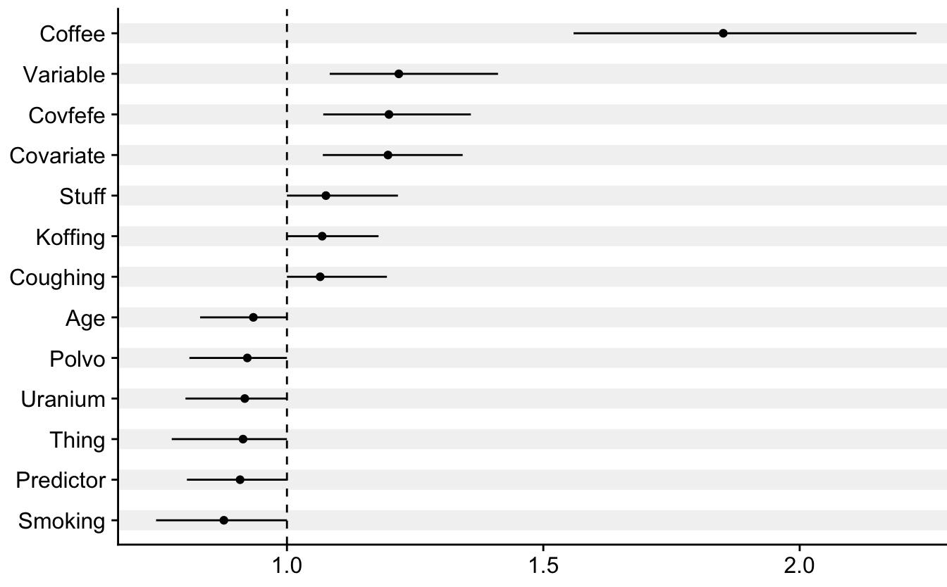
The Forest Plot
The forest plot itself is not hard to do. Notice how I create this striped pattern with geom_vline(aes(xintercept = name), col = "grey95", size = 5). I’ll do the same thing to the table part of the figure later.
Code
p1 <- d |>mutate(name =fct_reorder(name, mean)) |>ggplot(aes(x = name, y = mean,ymin = lower, ymax = upper)) +geom_vline(aes(xintercept = name), col ="grey95", size =5) +geom_hline(yintercept =1, lty =2) +geom_point() +geom_linerange() +coord_flip() +labs(x =NULL, y =NULL) +theme(plot.margin =margin(t =5, r =-4, b =5, l =5))p1
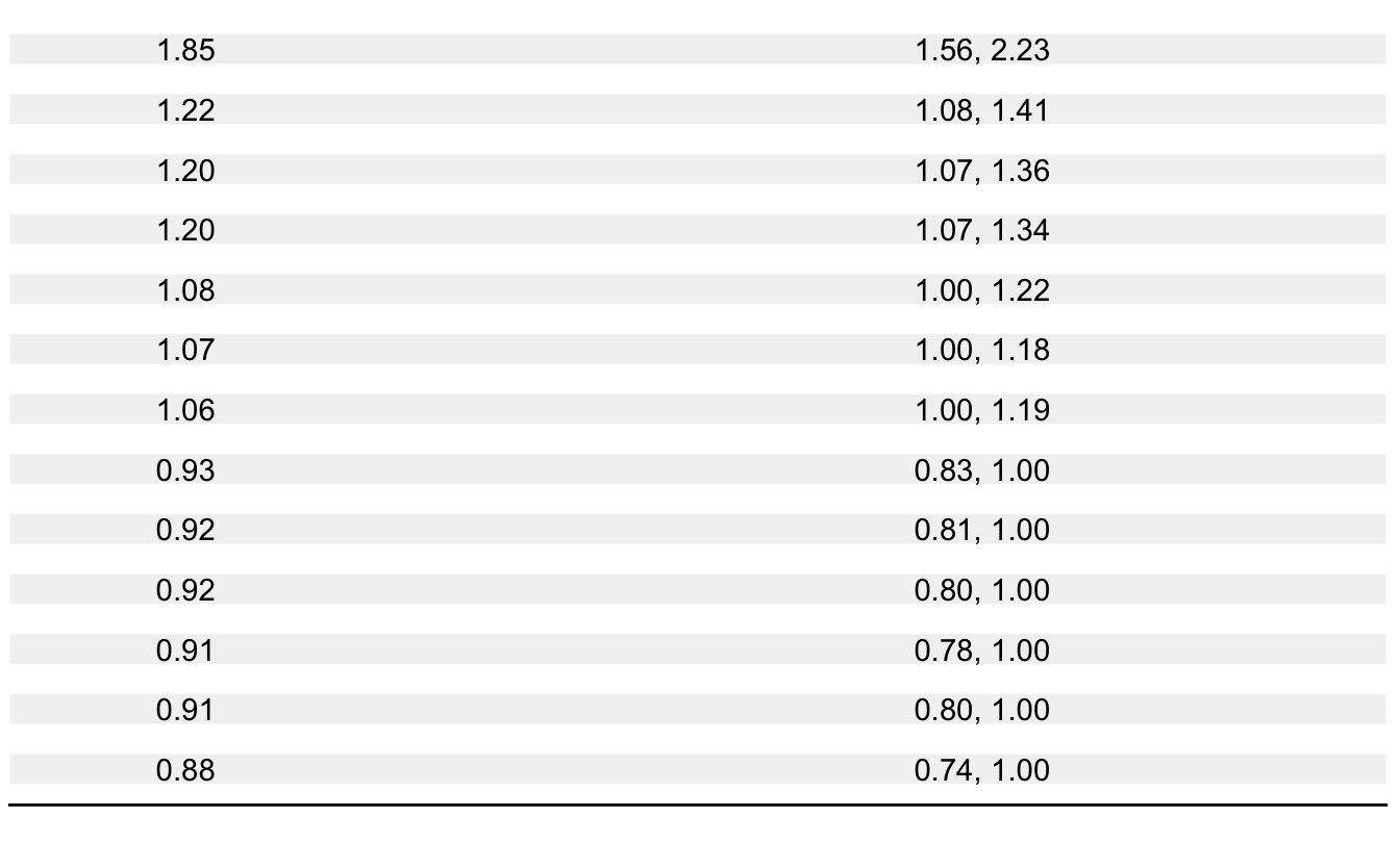
The Table
To make the table look nice I convert the numbers to text and clean them up so that the text is justified nicely when plotting it. I did some manual tuning of the margins to make the plot and table line up nicely.
Code
p2 <- d |>mutate(name =fct_reorder(name, mean),mean =round(mean, 2),mean =str_pad(mean, width =4, side ="right", pad ="0"),lower =round(lower, 2),lower =as.character(lower),lower =ifelse(lower =="1", "1.00", lower),lower =str_pad(lower, width =4, side ="right", pad ="0"),upper =round(upper, 2),upper =as.character(upper),upper =ifelse(upper =="1", "1.00", upper),upper =str_pad(upper, width =4, side ="right", pad ="0"),ci =str_c(lower, ", ", upper)) |>ggplot(aes(x = name)) +geom_vline(aes(xintercept = name), col ="grey95", size =5) +geom_text(aes(label = mean, y =1)) +geom_text(aes(label = ci, y =1.07)) +coord_flip(ylim =c(0.99, 1.1)) +theme(axis.title =element_blank(),axis.text =element_blank(),axis.ticks =element_blank(),axis.line.y =element_blank(),panel.border =element_blank(), panel.grid =element_blank(), plot.background =element_blank(),plot.margin =margin(t =5, r =5, b =19.3, l =0))p2
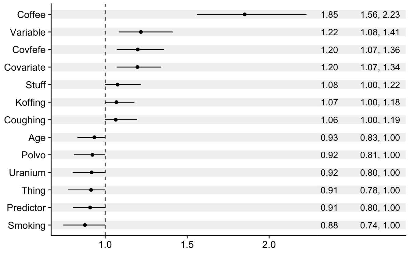
The finished bottom row
Now we have alligned the plot and table. If you zoom in you might see that they don’t line up perfectly. I am not liable for any bodily harm caused by this.
I admit that this is a pretty handwavy manual way to make the header fit, and there is probably a nice way to automatically fit this using the coordinate system.
Code
top_row <-ggplot(data =tibble()) +geom_text(aes(y =1, x =0.02, label ="Variable"), size =5) +geom_text(aes(y =1, x =0.84, label ="Mean"), size =5) +geom_text(aes(y =1, x =0.98, label ="95% CI"), size =5) +coord_cartesian(xlim =c(0, 1)) +theme_void() +theme(plot.margin =margin(t =0, r =5, b =0, l =5),axis.line.x.bottom =element_line())top_row
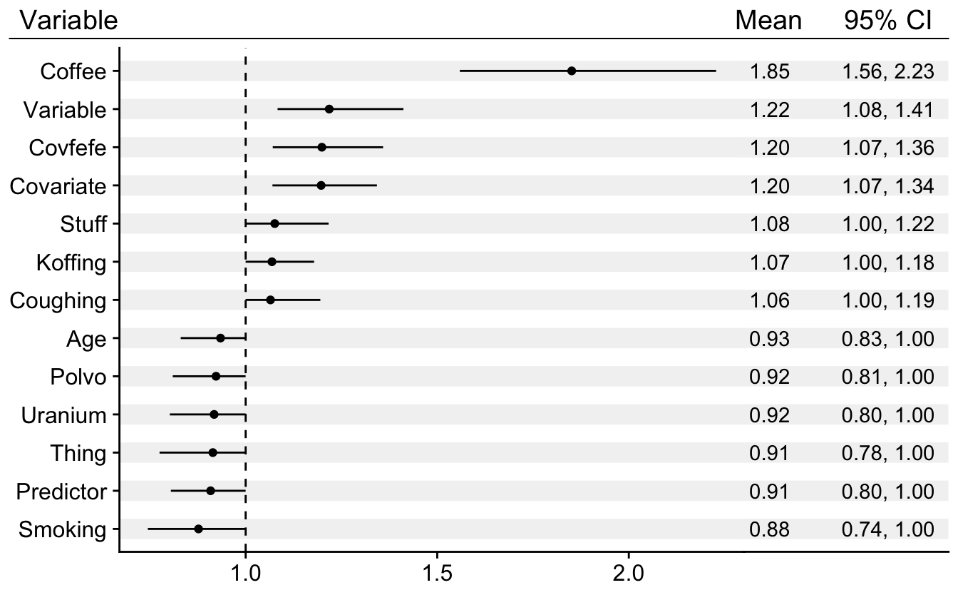
Putting it all together
And so we come to the finished plot. If we wrangle the rel_heights setting a little bit we can get a pretty nice looking forest plot and table hybrid.